

MLE SPOONS
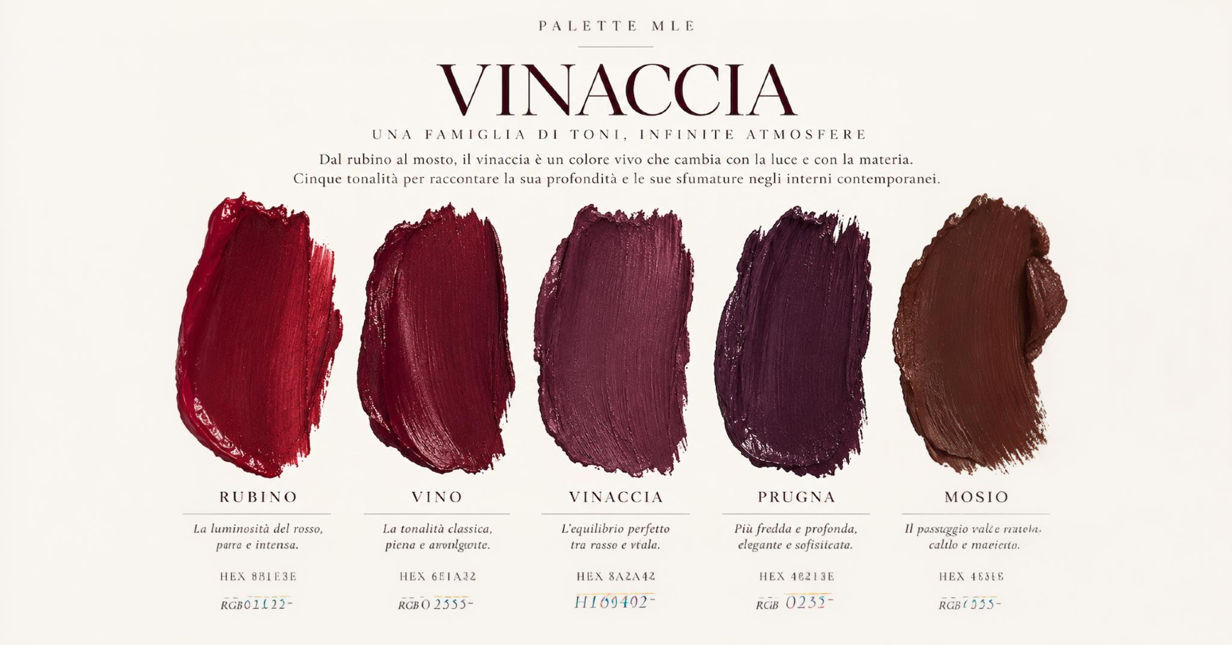
After the green of September, color continues to define the space through a deeper, more enveloping shade. For MLE, October is the color of wine. From ruby to plum, from purple to shades verging on brown, the MLE Palette continues its journey through colors that evoke hospitality, architecture, and design.
When Color Sets the Mood
Ruby, purple, plum—all the way to the darkest shades that border on brown. The wine’s color shifts with the light and the surface: it takes on depth against velvet, becomes transparent in glass, appears warmer next to wood, and takes on an almost nocturnal quality on matte surfaces.
In interiors, it makes spaces feel cozier without necessarily making them feel heavy. It can cover an entire wall, be limited to just a few elements, or emerge from the combination of materials that share the same color temperature.
For PALETTE MLE, October explores this color palette through five contemporary hospitality venues, examining color for its ability to envelop, accentuate, define, warm, and ground a space.
WRAP
Nolinski Venice
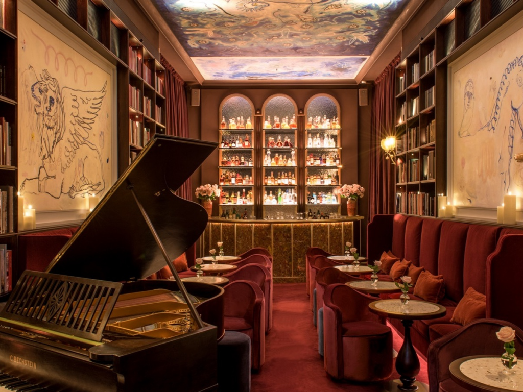
At the Library Bar at the Nolinski Venice , color creates an intimate atmosphere. Velvet, rugs, dark wood, and deep hues visually shorten distances and blur the boundaries between furnishings and surfaces.
In the interiors designed by Le Coadic & Scotto, burgundy does not appear as an isolated accent: it flows through the space, interacts with the blue and the dark wood tones, and contributes to the intimate, almost ethereal atmosphere that characterizes the library. The color does not simply cover the space— it envelops it.
EMPHASIZE
Four Seasons Hotel Florence
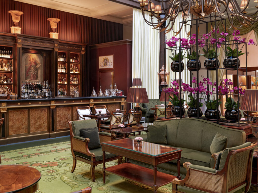
At the Atrium Bar of the Four Seasons Hotel Florence , burgundy is used sparingly, without dominating the room. It appears on the bar’s surfaces and contrasts with green, dark wood, fabrics, and floral arrangements.
In a setting already rich in texture and detail, a single intense shade is enough to shift the balance of the composition and draw the eye. It doesn’t need to fill the entire space to make an impact: sometimes color gains its power precisely when it’s used sparingly.
DEFINE
SENZA Hotel, Napa Valley
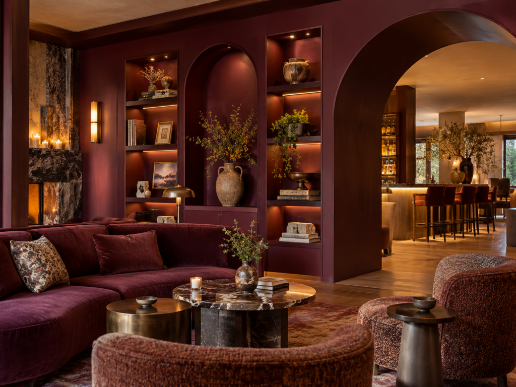
In Napa Valley, the color of wine fits almost naturally into the design. In the Lobby & Lounge of the SENZA Hotel, redesigned by Mendil + Meyer, wood, stone, and metal are complemented by deep hues that evoke the region’s landscape and wine culture.
A large, plum-and-grape-stalk-colored structure incorporates niches, bookshelves, and arched passageways, transforming color into a true element of the design. It is no longer merely a surface: it defines openings, creates depth, establishes hierarchies, and shapes our perception of the space. Color defines a space.
HEAT
Castle Badia
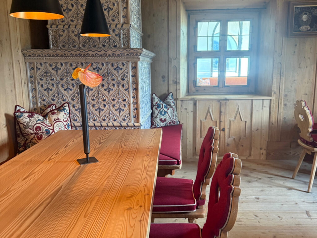
To Castel Badia , grape pomace meets wood. The chairs around the large table stand out against surfaces left in their natural tones, while the majolica stove and embroidered fabrics introduce different patterns and textures.
It’s a simple combination, but one that can transform the visual atmosphere of the room. The deep red of the upholstery breaks up the continuity of the wood without clashing with it, making the space feel warmer, cozier, and more homey. Here, the color doesn’t need to cover large surfaces— it warms the space through the materials that surround it.
ROOT
Borgo San Felice
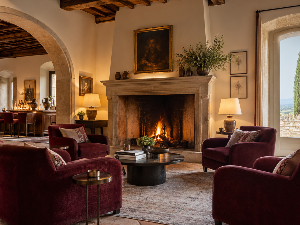
In Chianti, the term “vinaccia” inevitably takes on a different meaning. In Borgo San Felice, Relais & Châteaux, the deep tones of the interiors blend with stone, wood, and natural colors, while just beyond the rooms lies the landscape of vineyards surrounding the village.
The connection to wine goes without saying: it is an integral part of the place. The interior color palette thus seems to extend what exists outside, transforming color into a point of connection between the design and the local area.
“Taking root” also means this: ensuring that an interior becomes part of the surrounding landscape.

